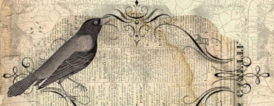
So...I think I have done it. I think I have created a new layout that I like and a header that I LOVE. The one thing I may mess with now is the text font. But other than that, I may actually be happy. What you are looking at right now my friends is what may very well be the NEW look of My Name is Not King.
I am using just the blogger SIMPLE template, with a barn wood background image blogger provided as an option. I was really liking the wood part, but obviously the plain text and beige background was makin' for a real boring header.
As it has been snowing here nonstop and I have nothing better to do, I decided to do a little messing around with header designs.
I went a googlin' for designs that would match my wood background and I was able to find this header from the Background Fairy site.
It was cool to begin with, and it had the vintage feel I like. Plus it had a crow (*which we can just pretend is a raven to make me happy.) But it wasn't QUITE what I wanted. The colors were a little off and obviously the whole blog title need to be worked in there.
I am no pro, and I no longer have photoshop, so I stooped to the picnik level, but I am actually quite pleased with how I things came out. Photoshop is much more elaborate and has many more options, but picnik is quick in simple (but unfortunately will no longer exist when April comes around.).
The final product is what you are looking at right now:
A darker, more stained, embellished, and with text version of the original. And I am actually really pleased and I don't *THINK* I will be changing it again. But still, I would love to hear your thoughts on the matter. And check out the previous post to see the other designs I was playing with.
And also, up for grabs I have this NEW and IMPROVED blog button! I use a tutorial over at the blog (Live. Love. Craft.) of my new bloglandria buddy Alyssa, as I had forgotten how I had done it the first time (ohh HTML, you're so silly...). Feel free to take it off of here, or over on my sidebar, underneath my "who I am pictures". I will be working on one for my photoblog- Sometimes I Shoot Things- next!


8 comments:
I really really like it. :)
thanks very much! I am pretty happy too!
I like this one the best! I love the header most definitely! :)
Hey, thanks so much for dropping by my little blog and leaving those comments! I love reading them!
P.S. You're blog is super cute. :) And your layout is beautiful!
Your header looks pretty cool, lovely layout :)
I've got another blogger award for you, the Versatile Blogger award :-)
http://versatilebloggeraward.wordpress.com/about/ Consider yourself nominated :-)
Yes. Keep this one. It's not too gothic, but it's got the Poe element. It's artsy, outdoorsy...I like it. :)
On the off chance that on your big day somebody tested you to "give an entire 1% of your opportunity every week" to each other, to simply be as one, calmly filtering through the odds and ends of your lives; giving space for your adoration to recoup, recuperate, find and develop... what may you have said?More Informations
Post a Comment